Role:
Designer
Company:
Ivy Investments
Date:
August, September 2019
End Product:
Email Newsletter

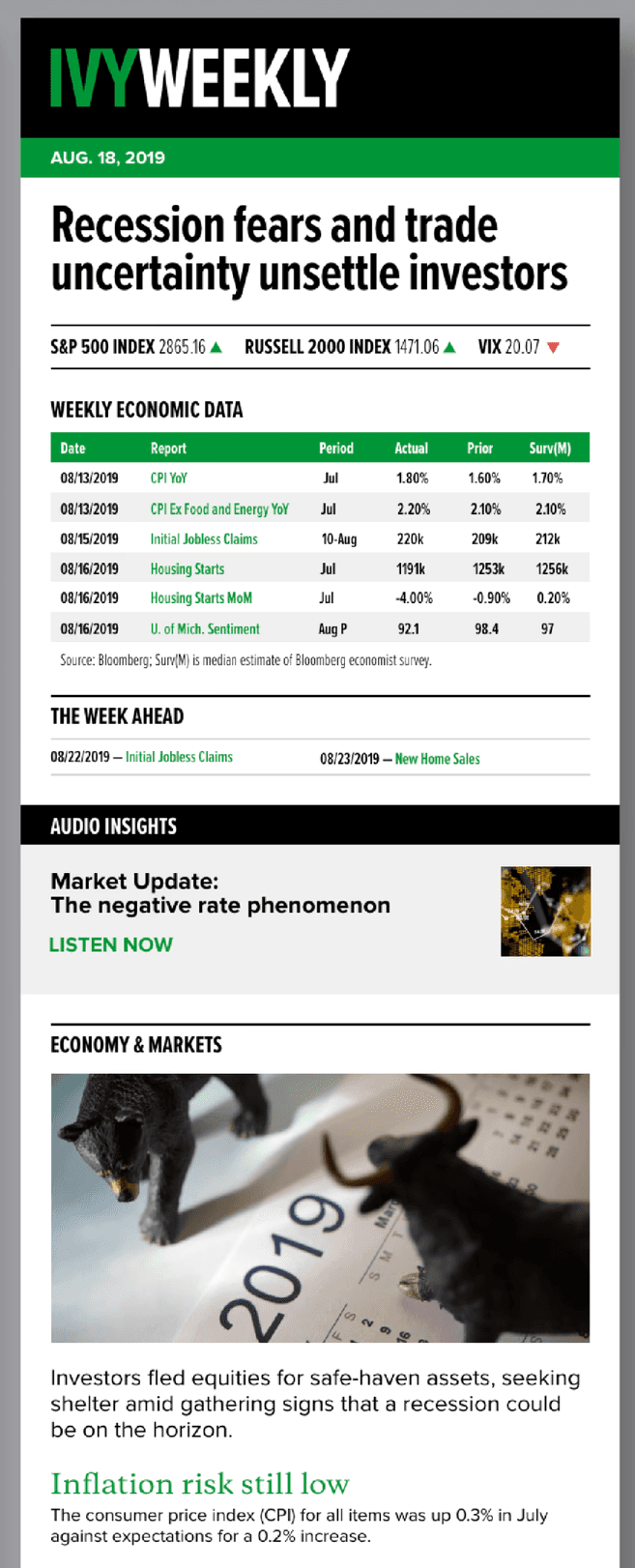
The process wasn't working. And Ivy Weekly needed to match the brand.
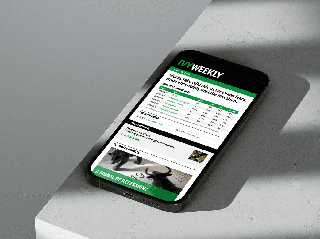
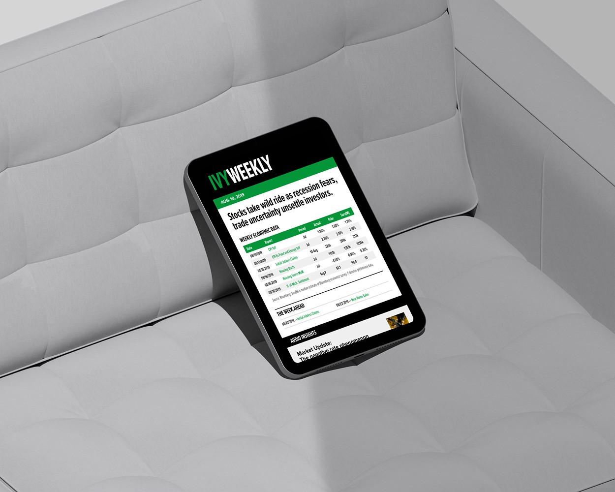
The was a missing step in the process. There was no design step between content creation and html production. The individual coding the html newsletter didn't have the time or the skills to take the newsletter to a new level — one that would resonate with the brand and the needs of external clients. Ivy Weekly needed to be a bolder, message forward version of itself. It needed brand fonts, color, images, icons.
Before I got this project, I had been noodling a little in Sketch and eventually more and more in Adobe XD [since we had Creative Cloud at work]. I had proposed the idea of getting the design team involved in UI design to improve the look and feel of our websites. While the idea was well accepted, it was decided to start with a few html email projects.
I would like to say that after the redesign of the Ivy Weekly sign-ups for the newsletter increased. And, well, they did. But there were never any clear metrics presented or associated with the increase in subsriptions. After the redesign, the newsletter was promoted across more channels and differently than before.
Lessons learned? First, host your own fonts if you can. It was technically a struggle for us, but was eventually worked out and well worth the effort. Second, don't let your brand efforts become watered down over time. The first several weeks of the new Weekly was much bolder, used more photos to help communicate the journalistic style of the Ivy Investments brand. Eventually it became text heavy with a smattering of icons.